Flat lays are the beauty world’s visual shorthand. One overhead photo and you can communicate a vibe, a routine, a product lineup, a seasonal mood, or a full brand identity. Done well, a flat lay feels clean and intentional, like it belongs on a website homepage or the opening slide of a product launch. Done poorly, it looks like you dumped your bathroom cabinet onto a table and hoped the camera would negotiate the chaos into something cute.
The difference isn’t expensive gear. It’s composition. Flat lays live and die by arrangement, spacing, and the small design choices that guide the viewer’s eye. The good news is, you can learn a handful of composition tricks that reliably make beauty products pop, even if you’re shooting on a phone in your kitchen.
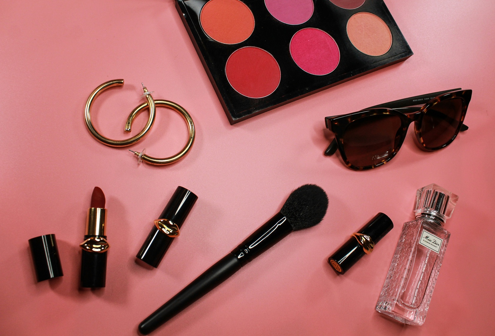
This guide covers a practical DIY workflow for beauty flat lays: choosing a background, building a palette, arranging products, using negative space, creating depth, and editing for a clean, modern look. You’ll also learn how to avoid the most common flat lay mistakes and how to build variety without needing a mountain of props.
What Makes a Flat Lay Look “Professional”?
A great flat lay does three things:
- It creates a clear focal point (the hero product or message)
- It uses supporting elements to frame that focal point, not fight it
- It feels cohesive in color, texture, and style
Professional flat lays also tend to have:
- Consistent lighting (soft, directional, and controlled)
- Clean edges, straight lines, and intentional spacing
- A limited palette (fewer colors, more harmony)
- A sense of rhythm (repetition of shapes, sizes, or tones)
Think of your flat lay like a tiny poster design. You’re arranging objects as graphic elements. When you shoot overhead, your products become shapes and colors first, and “things” second.
Step 1: Choose the Right Background (Because It Sets the Mood)
Your background is the stage. If the stage is noisy, your products will have to scream to be seen.
Reliable flat lay backgrounds:
- Matte white or warm off-white poster board (clean and timeless)
- Light gray foam board (modern and forgiving)
- Beige or sand tones (warm minimal, spa vibes)
- Subtle stone or ceramic tile (adds texture without clutter)
- Linen fabric (only if it’s steamed and used sparingly)
Avoid backgrounds that make products harder to read:
- Busy patterns and strong wood grain
- Faux marble prints with repeating texture
- Highly reflective surfaces unless you want a glossy editorial look and can control reflections
Pro tip:
Foam board is one of the best DIY background materials. It’s cheap, matte, and easy to swap. Keep two or three colors on hand and you can create a consistent look across many shoots.
Step 2: Pick a Palette Before You Pick Props
Flat lays go sideways when the colors don’t get along. The quickest way to create a premium feel is to limit your color palette.
Easy palette formulas:
- Neutral base + one accent color (white + blush pink, beige + sage green)
- Monochrome (all warm neutrals, all cool grays, all pastels)
- Two-tone (black/white, beige/white, gray/cream)
If your products are already colorful (bright packaging, bold labels), keep everything else neutral. If your packaging is neutral, you can bring in a single accent color through a prop, a towel edge, or a backdrop.
A simple rule: If you have three strong colors competing, reduce it to one.
Step 3: Start With the Hero Product and Build Outward
Flat lays are easiest when you choose a hero product. That hero can be:
- The newest product
- The highest margin product
- The product you want people to click
- The “anchor” of a routine (cleanser, sunscreen, serum, etc.)
Place the hero first, then add supporting items around it like you’re building a frame. If you place everything at once, you’ll spend longer rearranging because you never established the focal point.
Step 4: Use One of These Layout Templates (They Always Work)
When you’re stuck, use a template. Templates reduce decision fatigue and keep your compositions clean.
The Grid (Clean, modern, e-commerce friendly)
Arrange products in evenly spaced rows and columns. This is perfect for product collections and “routine” flat lays.
How to make it pop:
- Keep spacing consistent
- Align labels and caps
- Use one product as the hero by placing it center or slightly larger
The Diagonal (Dynamic and editorial)
Place the hero on one diagonal third of the frame, then arrange supporting items along the diagonal line.
Why it works:
Diagonal lines create movement. The eye naturally follows them, making the flat lay feel active and modern.
The Circle or Wreath (Soft, lifestyle-friendly)
Place products in a loose circle with the hero in the center or slightly off-center.
Why it works:
The circle frames the hero and feels cohesive. Great for skincare rituals and seasonal themes.
The Triangle (Classic visual hierarchy)
Place the hero at the top or center, then arrange two supporting items to form a triangle shape.
Why it works:
Triangles feel stable and intentional. This is a simple way to create hierarchy without making the shot busy.
The “Rule of Odds” Cluster (Stylish minimalism)
Group 3 or 5 items close together, then add a few small elements like a dropper, cotton pads, or a single leaf.
Why it works:
Odd-number groupings feel more natural and less stiff than even-number clusters.
Step 5: Negative Space Is Not Empty Space, It’s Luxury
Negative space is the area in your photo where nothing is happening. In flat lays, negative space is what makes products look important. It’s also what makes your images usable for marketing, because you can add text overlays without covering products.
How to use negative space:
- Leave one clean “quiet corner” of the image
- Don’t fill every gap with a prop
- Spread items out slightly more than feels necessary
If your flat lay feels cluttered, remove one item. If it still feels cluttered, remove another. Clean compositions often feel “too simple” while you’re building them, then look perfect in the photo.
Step 6: Create Depth Even in a Flat Lay
Flat lays are naturally flat, but you can add subtle depth with height and shadow.
Easy ways to add depth:
- Stack one or two items (a box under a product, a small acrylic riser)
- Use a tray or dish to create layers
- Angle a product slightly instead of placing everything perfectly parallel
- Use a fabric fold (minimal) to create shadow gradient
The goal is subtle dimensionality, not a tower. A small height change makes the layout feel designed rather than arranged.
Step 7: Use Repetition to Make the Scene Feel Cohesive
Repetition is a design trick that makes flat lays look intentional. Repeating shapes or colors creates rhythm.
Examples:
- Three round jars + one tube
- Repeating metallic caps
- Repeating label colors
- Three cotton pads arranged in a line
- Two or three droppers placed with similar spacing
Repetition helps the viewer’s eye flow smoothly through the composition. Without it, the eye jumps around and the shot feels chaotic.
Step 8: Keep Labels Legible and Brand-Forward
In beauty flat lays, the label is often the point. If the viewer can’t read the product name, you’re missing an opportunity.
Label tips:
- Rotate products so labels face the camera (straight up)
- Avoid glare by using diffused light
- Clean smudges and fingerprints
- Keep caps aligned for a neat look
If you want a more editorial vibe, you can turn one supporting product sideways or show the back label for variety, but keep the hero label readable.
Step 9: Lighting That Flatters From Above
Lighting makes or breaks flat lays because overhead photos can look flat and lifeless if the light is too even, or harsh if the light is direct.
The best DIY lighting:
- Indirect window light from one side
- A sheer curtain for diffusion
How to set it up:
- Place your setup near the window
- Light should come from the side, not directly from above
- Use a white foam board on the opposite side to fill shadows gently
Avoid:
- Direct overhead lights (ugly shadows and yellow tones)
- Shooting in mixed lighting (window + warm bulbs)
- Direct sun (harsh shadows that slice across the scene)
Pro tip:
If your shadow direction changes between shoots, your flat lays won’t feel consistent on a feed. Keep the window on the same side each time.
Step 10: Add Texture Shots and “Ingredient Cues” Without Mess
Small texture details can elevate flat lays, especially for skincare.
Clean ingredient cue ideas:
- A single smear of cream on a ceramic palette
- A droplet of serum near a dropper
- A few salt crystals or powder for mask products
- One botanical leaf if it matches the product story
Keep it minimal. Too much texture becomes a mess, and mess is the enemy of modern flat lays.
Editing Flat Lays for a Clean, Modern Finish
Editing should polish, not transform.
A simple edit checklist:
- Straighten the image so edges feel aligned
- Correct white balance so whites aren’t yellow or blue
- Reduce highlights if glare is blowing out labels
- Lift shadows slightly if the scene is too contrasty
- Increase contrast gently for crispness
- Avoid heavy saturation, it can make products look less premium
If you want to keep a consistent brand look, save a simple editing preset that you use across all flat lays. Consistency builds trust.
When Stock Imagery Can Support Your Flat Lay Content
Your own flat lays are best for showing specific products and packaging, but you don’t have to create every visual element from scratch for every post. Using professional stock photos can be a helpful way to add variety for blog headers, seasonal mood imagery, or abstract backgrounds that match your palette, especially when you’re building a content calendar and need consistent visuals at scale. The key is to use stock imagery as support and keep your product-specific shots original and accurate.
Common Flat Lay Mistakes (And How to Fix Them)
Mistake: Too many props
Fix: Remove items until the hero product is obvious.
Mistake: Random color chaos
Fix: Limit your palette to neutrals plus one accent.
Mistake: Everything is the same height
Fix: Add one tray, riser, or box under a product to create layering.
Mistake: Harsh shadows or yellow light
Fix: Use window light with diffusion and turn off indoor lights.
Mistake: Labels aren’t readable
Fix: Rotate products, diffuse glare, and clean packaging.
Mistake: Spacing is inconsistent
Fix: Use your fingers as a measuring tool. Keep gaps roughly equal.
A Simple Flat Lay Workflow You Can Repeat Every Time
If you want a repeatable “flat lay routine,” follow this:
- Choose a background and palette
- Place the hero product first
- Pick a layout template (grid, diagonal, circle, triangle, cluster)
- Add supporting products and one or two props
- Create negative space intentionally
- Add one subtle texture cue if relevant
- Light with soft side window light and fill with a white board
- Shoot variations: wide, tighter crop, detail close-up
- Edit with consistent white balance and gentle contrast
This workflow turns flat lays from “guessing” into “system.” And systems create consistency.
The Bottom Line
DIY beauty flat lays don’t require a studio. They require design thinking. Choose a quiet background. Limit your palette. Build around a hero product. Use layout templates to stay structured. Embrace negative space. Add subtle depth with layering. Keep labels clean and legible. Light softly from the side. Edit gently for realism and consistency.
When you approach flat lays like a graphic designer rather than a collector of cute props, your images start to look premium automatically. Your products pop because the scene stops competing with them. And the best part is once you build a repeatable setup, you can produce content quickly, consistently, and beautifully, even with a phone and a piece of foam board.
Featured Image Credit: Nick Noel